
More than 7 years after Twirlbound was founded, it’s high time for a much-needed branding update – this is Twirlbound v2!
It’s important to keep up with the times and reflect on things every now and then, which is why we spent some time rebranding our logo and identity. It’s still Twirlbound, but with a fresh coat of paint!
We’re happy with how it turned out – it’s still our familiar spring and ball, but much cleaner and more readable. Moreover, we now have different versions for different backgrounds to ensure we can use it wherever we need it.
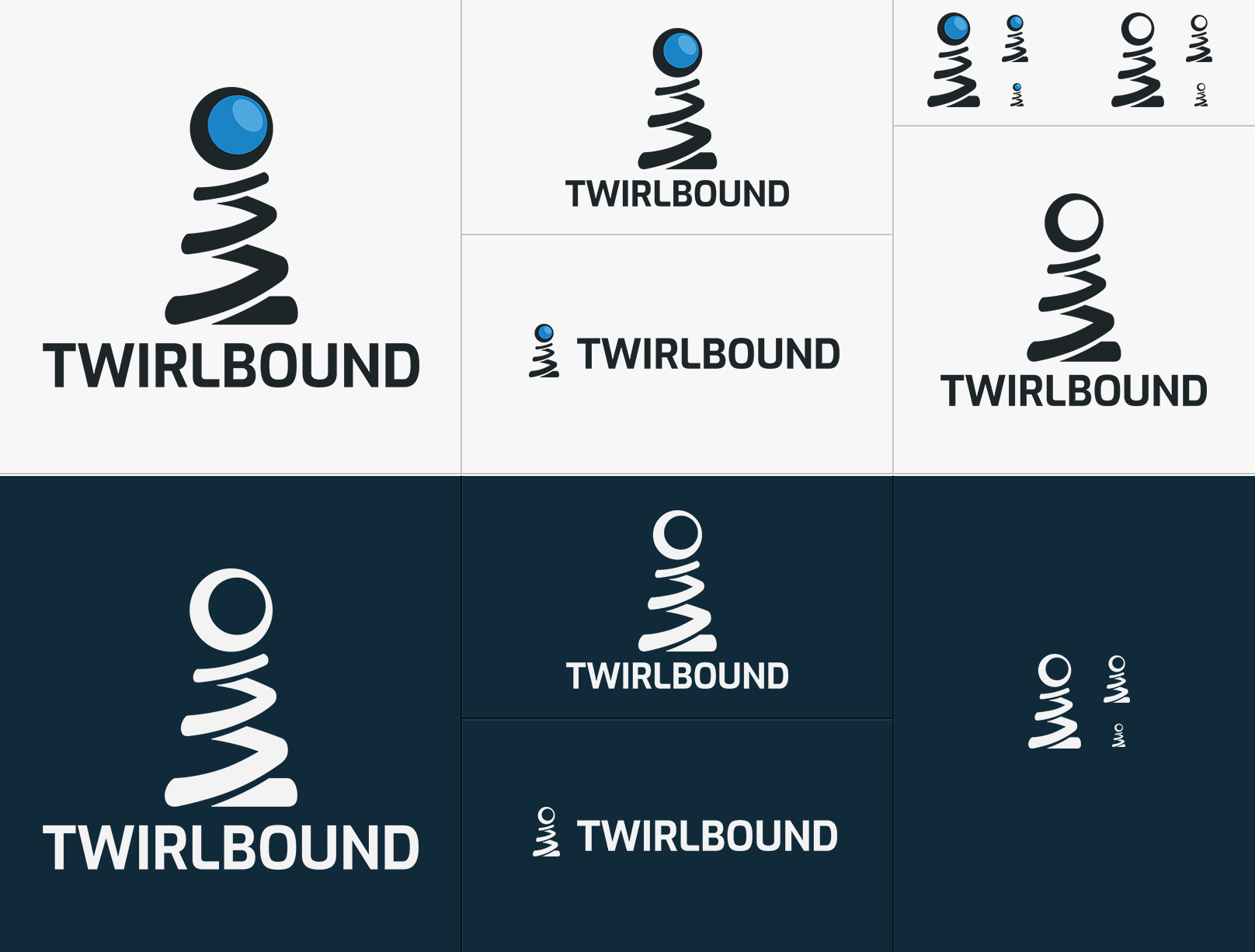
It took us some time getting used to internally, but we’re happy we took this step – a more mature and modern look for Twirlbound!
A trip down memory lane
Because we don’t do this every day, let’s take a look where it all started…
This first logo was made long before Twirlbound was even a company, created by co-founder Matthijs from the comforts of the highschool library PCs in a break. Not… fantastic.
Soon after, probably due to some necessary feedback by co-founder Marc, another revision was made. This time without the heavy blob shadow and the “i” in the shape of a… squatting person.

Frolic, eh? Well, not only was it rather sub-par in terms of quality, it was also barely usable – a very horizontal, text-only shape. But the idea of the actual first logo started to come across in the spiralled “i” and falling/bouncing “o”!
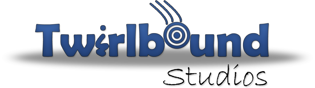
When things started to get more official, Marc started drafting a more iconic, silhouette-based logo that we would use for the 7 years after. You might still know it, as do we – but it was time for something new!

We hope you like it as much as we do!